
If you’re tracking MSFT or just curious about how Microsoft’s stock is performing, checking the Microsoft stock graph is often the first step. That chart tells a powerful story—of market trends, investor sentiment, and big events in one of the world’s most important tech giants. It’s not just lines on a graph—it’s insight into what matters in AI, cloud, and global tech.
Here, we’ll break down what that graph actually shows, how it’s evolved, and what it means for investors. We’ll include real examples, expert insights, plus tips and tools to help you interpret trends using charts and data.
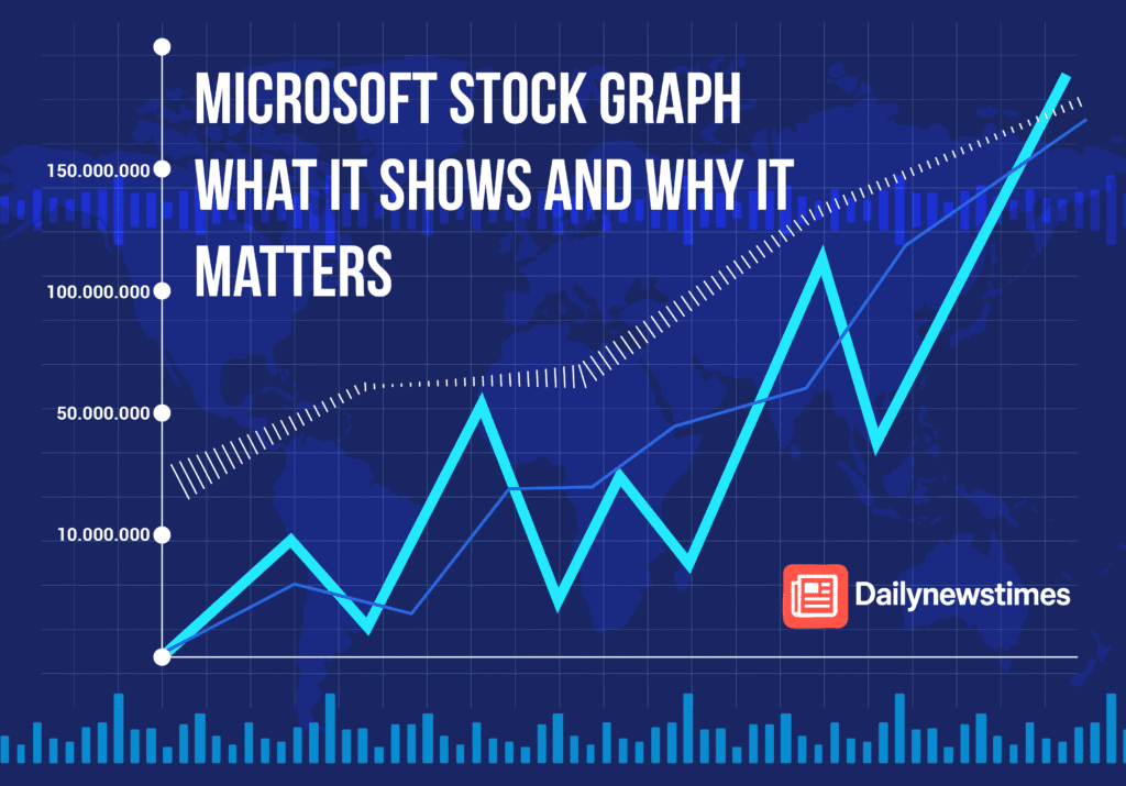
What The Microsoft Stock Graph Represents
When you open a Microsoft stock graph, such as on Yahoo Finance or TradingView, you’re seeing:
- Price changes over time – minute-by-minute, daily, weekly or longer
- Key data overlays – volume, moving averages, trendlines
- Financial events – earnings dates, dividends, major news
It’s a visual way to supply info about momentum, momentum shifts, and whether Microsoft’s valuation is expanding or contracting.
How Microsoft’s Stock Graph Has Trended In 2025
Record Highs And Sustained Rally
Microsoft hit all-time highs above $500 in July 2025, closing around $503.32 on July 11—the highest in its history (TradingView, Macrotrends). That graph shows a clear uptrend—MSFT has climbed about 20% year-to-date and roughly 46% since April (Investopedia).
Powerful AI And Cloud Momentum
Recent gains are largely fueled by AI and cloud services. Oppenheimer upgraded MSFT to “outperform,” setting a $600 target citing its AI strength (Omni Ekonomi). You can actually see clusters of volume and price jumping after each AI-related news release.
Momentum Indicators
Technical signals like the “golden cross” (50-day moving avg crossing above 200-day) appeared on recent graphs, reinforcing bullish sentiment (Investopedia). Volume spikes during these crossovers often align with chart breakouts.
Reading The Microsoft Stock Graph Effectively
Scan Price Channels
Use tools like Barchart to see when Microsoft consistently trades within an upward channel. The stock has made new 52-week highs 22 times this year (Barchart).
Check Moving Averages
Compare MSFT’s 50 and 200-day moving averages—graph crossovers can signal trend confirmation or reversal potential.
Track Volume
Low volume on up days may hint at weak momentum, high volume often shows strong institutional backing (or selling).
Overlay Events
See how the graph reacts around events—like earnings on July 30, 2025. Pre/post-earnings graph spikes can show how markets are responding.
Compare To Benchmarks
Overlay the S&P 500 on TradingView to see if Microsoft is outperforming the broader market.
Microsoft Stock Graph Vs Fundamentals
Strong Financials
Microsoft’s TTM revenue is ~$270 billion with ~36% net profit margin (Investors, Simply Wall St). This solid base supports chart patterns—without fundamentals, technical breakouts mean less.
Analyst Sentiment
28 analysts rate MSFT as “Strong Buy,” with a 12-month price target of ~$536 (Stock Analysis). If charts break above resistance near $536, that aligns well with analysts’ consensus.
Pros And Cons Of Relying On The Stock Graph
✅ Pros
- Visual tool for quickly spotting trends
- Makes it easier to set entry/exit based on technicals
- Helps align investor sentiment with news events
⚠️ Cons
- Can be misleading in low volume or manipulated markets
- Too much focus on charts may ignore fundamentals
- False breakouts happen—earnings surprises can flip patterns fast
Real Investor Example
One retail investor on Reddit mentioned using the graph around the $500 milestone. They said: “I bought when it clamped down near that level a week after the golden cross, and just rode it into earnings week.”
That’s textbook chart-journalism—use graph patterns and event context together.
Tools To Build Your Own Microsoft Stock Graph
- TradingView – community scripts, overlays, and watchlists
- Yahoo Finance – simple interactive chart with news integration
- Barchart – shows performance metrics and trend channel analytics
- Simply Wall St – overlays fundamentals to graph, not just price (CoinCodex, Simply Wall St)
FAQs
Q: What’s A Golden Cross On MSFT Graph?
A: When the 50-day moving average crosses above the 200-day—it signals bullish trend continuation and has happened recently.
Q: Is MSFT Overvalued At $500+?
A: Some analysts argue it’s extended—PE ratio near its 5-year highs. Others say AI growth justifies it. Check both technicals and fundamentals.
Q: How Does MSFT Graph Compare To Other Big Tech?
A: Compared to Nvidia and Amazon, MSFT is more stable, with less volatility—but it’s part of the same rally, driven by AI.
Conclusion Actionable Takeaways
- The Microsoft stock graph shows a clear upward trend, supported by AI-cloud growth.
- Use moving averages, volume, and momentum signals to identify good entry points or warning signs.
- Combine visual tools with solid fundamentals and analyst forecasts for smarter decisions.
- Stay alert around events like earnings or regulatory updates—they often break the trend.
In other words, don’t just stare at the lines—understand why they move. That’s how you turn a stock chart into a real decision-making tool.